
Now that we are able to access the SarcMark homepage, oh what joys there are to be found...
Tuesday, January 26
A Well-Marked Wit
Wit has truth in it; wisecracking is simply calisthenics with words.
--Dorothy Parker
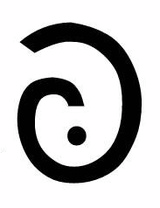
A new punctuation mark is being offered to the world. While I am a firm believer in the purpose and power of punctuation, I greet this news with a shrug. The SarcMark, which was "temporarily" unavailable at the time of this post, seeks to save the world from misunderstanding, much like applause and laugh signs saved the live sitcom and game show from silence.
The SarcMark, which closely resembles a curly fry, is intended to be used at the end of a sarcastic statement in text, IM, email, etc. Thus, you can let your reader know that you were not, of course, being serious but snarky. Now if your reader never appreciates sarcasm even when there is a large signal to commemorate its passing, then you are without luck.
In my non-sarcastic opinion, ironic wit is weakened when you add an elaborate punctuation mark: like a punctuated wink. There is a satisfaction in a successfully conveyed witty remark, and conceding your joke by giving your audience the nudge to "get it" lessens the triumph of irony. Granted having your sarcastic comment met with confusion-induced silence can be socially awkward, yet even in those awkward scenes there is a humor that can be appreciated.
If, however, your sarcasm places you in more socially awkward situations than your sense of humor can tolerate, or if fear of causing offense has kept you from exercising verbal "calisthenics," then the SarcMark should be a welcome sign to you. For the low low price of $1.99, you too can be as ironic as you desire without the worry of confusing or offending your less sarcastically-inclined friends. If only they'd throw in a comma and bonus exclamation point, I might just be sold.
Saturday, January 23
Eighty Candles for Derek Walcott
Today marks the 80th birthday of the Caribbean poet, playwright, and sometimes watercolorist Derek Walcott. To celebrate his work and years, I'll post a small poem-gift for you this weekend. (And yes, this is from a man who is, as you might have heard during last year's hullabaloo over the Oxford professorship of poetry, not only a man of verse but quite the fanny-pincher.)
The poem below is the first in Midsummer (1984), a copy of which I purchased in the basement of a tiny English-language bookshop in Athens three years ago. As you will notice from the opening line, this is a fine poem to take with you when traveling. Sometimes you can arrange the timing of the poem and of the plane just so, and read the last lines as the rubber wheels meet the landing strip. Without further ado, the promised poem:
The jet bores like a silverfish through volumes of cloud—clouds that will keep no record of where we have passed,nor the sea's mirror, nor the coral busy with its ownculture; they aren't doors of dissolving stone,but pages in a damp culture that come aprt.So a hole in their parchment opens, and suddenly, in a vastdereliction of sunlight, there's that island knownto the traveller Trollope, and the fellow traveller Froudefor making nothing. Not even a people. The jet's shadowripples over green jungles as steadily as a minnowthrough seaweed. Our sunlight is shared by Romeand your white paper, Joseph. Here, as everywhere else,it is the same age. In cities, in settlements of mud,light has never had epochs. Near the rusty harboraround Port of Spain bright suburbs fade into words—Maraval, Diego Martin—the highways long as regrets,and steeples so tiny you couldn't hear the bells,not the sharp exclamations of whitewashed minaretsfrom green villages. The lowering window resoundsover pages of earth, the canefields set in stanzas.Skimming over an ocher swamp like a fast cloud of egretsare nouns that find their branches as simply as birds.It comes too fast—this shelving sense of home—canes rushing the wing, a fence; a world that still stands asthe trundling tires keep shaking and shaking the heart.
Friday, January 22
Rainy Days and Mondays
 Can you really put a number on a bad day? According to a study cited at the Mental Floss blog, yes, you can. We are all to be congratulated on surviving the "most depressing day of the year": last Monday, January 18. If Monday, really was not that bad on your depression scale, you can always look at the formula yourself and make your own calculations. Who knows, maybe your worst day is yet to come.
Picture Book: André Kertész's 'On Reading'

Tonight I've picked up my small white edition of André Kertész's sparsely titled On Reading, first published, lushly, in 1971 and reprinted, not so lushly, in 2008. With photographs as beautiful and intimate as his, it seems only proper to share a few of them with you in our corner.
Perhaps you are already familiar with his work, such as this one of a perfectly poised fork or this one, of a patch of street at the Eiffel Tower's feet; either way, his is a pleasant ouevre to view and view again. I have also enjoyed his pictures of bodies distorted in mirrors, such as this one from 1933, Distortion, making limbs look like statuesque taffy or Henri Moore sculptures or, at times, black-and-white snip-its of Dali paintings. As is the case with ruins, there is an unexpected comfort in seeing the human form warped, disfigured—and still harmonious. In fact, of the Parthenon, Moore wrote the following upon his visit to it in 1951: "In fact I would say that the Parthenon now is probably much more impressive than when it was first made. You feel the spaces much more, and the openings, and the fact that it’s not solid throughout and that the light comes in, makes it into a piece of sculpture and not, as it was before, a building with four external sides. It’s completely spatial now—a different object altogether.” Can you imagine a more hopeful way of considering things in ruin? His sentences make one think the Parthenon's time spent as a temple, cathedral, mosque, and then as an ammunition storehouse was not in vain.
But back to the book. It's exclusively of people of all sorts—gondoliers at rest, girls dressed backstage as fairies, boys dressed as men in overcoats, sunbathers, Trappist monks, Japanese metro-riders—found reading. The pictures were taken between 1915 and 1970 in several locales, among them his native Hungary, Paris, and New York. Reading was one of his lifelong subjects, perhaps in part because his father was a bookseller. Collected here are 23 of these pictures.
One of the curious things I noticed this time going through the book is that at no point am I encouraged to wonder which books are being read. The photographs aren't about the books themselves but about reading. When looking at his pictures, you seem to already know the book being read because the photograph echoes the sensation of reading, when you forget the book because you are so caught up in its sentences—or, in the case of a picture, its forms.
Yet it is natural to be inquisitive about books, to be on the metro ride home and peer over to see what Mr. So-and-so is turned to today. I think Kertész, if he means to say this, is correct: that we should take care to relish and appreciate our neightbor's quiet act of reading (which we would not want to disturb, whether with a too curious hello or nosy sidelong glance). In each frame, the book, and the person holding it, forms a sort of island; and the book seems an extension of the body.
With the advent of Kindle and other such reading devices, perhaps it will be easier to look at the act of reading itself as Kertész did instead of the book—or e-book—and, perhaps, to be less of a Book Snob. For in the world of Kindle, there is only one cover, Amazon's, cloaking every book in plain white plastic.
Thursday, January 21
Tome Clothes
 I suppose it is best to have an Augustinian stance about book design and say that at any point in the history of tomes there always have been ugly ones and beautiful ones. I would rather not wail about the loss of a "golden age" of publishing, or think we are progressing toward such a "golden age." It is more level-headed to suppose that gold was, is, and will be mixed in with lesser metals. And yet I keep finding the books made in the pre-Photoshop days to be more charming and attractive than most of today's.
I see a good number of books, partly because I work in a magazine's books & arts section, but also because I have a few prodigiously read friends who tell me about scrumptious tomes that I should, as the angel said to Augustine, "take up and read," and which I probably would not have found without their faithful counsel. The books they recommend tend to be the loveliest ones. Today, the latest—The Spanish Journey by Julius Meier-Grafe (1926)—arrived: a British racing green cloth-bound copy with a wee lion roaring on its hind legs on the center of the front cover.
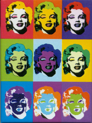
But another book came today, too. And it is, I am afraid to say, a particularly unlovely tome. It parrots the color-block prints of Warhol, but in miniature and with more black that Warhol liked to use. At least this sort of ugliness stems from laziness and is not (I think) the product of careful planning from the folks at Continuum press.
But what is most discomfiting about this book is that its contents are first rate! This is the book! It is a Roger Scruton reader! Scruton's face has been Warholified 16 times and this means that his intellectual gaze is staring me down 16 times! Perhaps this is a joke? Either way, I am simultaneously intimidated by his gaze and appalled by the design. I think it is time to take off the dust jacket and take comfort in the oatmeal-colored boards.
For those yet unfamiliar with Scruton, you might want to consider taking a look at his new book I Drink Therefore I Am and this article, published in last week's Times Literary Supplement. The article is reviewing this book. Here's a teaser:
For Linzey, followers of foxhounds are “animal abusers”, comparable to those who torture cats and dogs for their amusement and who – according to research that he cites without question – are predisposed to become violent criminals when they turn their attention to their fellow humans. I conclude from this that Linzey may be a humane observer of animals, but he is no charitable observer of people. Maybe he cannot bring himself to attend a meet of foxhounds; but he could at least have consulted the literature, from Plato and Xenophon to Turgenev, Sassoon, Masefield and Ortega y Gasset, devoted to the place of hunting in a virtuous life.Can you tell he enjoys a good hunt?
Friday, January 8
All Lined Up for Spring
 In the midst of January and all its dreariness, I find myself longing for brighter seasons. Spring is an easy season to love with its warmer days and vibrant colors, and spring 2010's fashion season is bringing yet another reason to smile; a classic favorite is back in full force. In WSJ's On Style, Christina Binkley recently wrote about the return of nautical stripes, which sent me to both reminiscing classic Hollywood fashion of days past and looking ahead to my favorite spring catalogs.
Stripes, worn in moderation, provide a simple way to achieve the ever-popular Audrey Hepburn look. She was, of course, not the only star to rock stripes, but she is, for good reason, the one we quickly reference when seeking a "classic," stylish look.
So other than attempting to look like Audrey, what is the appeal of the nautical stripe? It's certainly a style you must be careful to wear correctly since stripes tend to accentuate. In spite of their potential for fashion hazard, stripes are a worthy addition for spring. Bright and crisp, they set things evenly and in order. And even if you have never been on a yacht, they can make you feel as though you would be quite comfortable there.
Spring's abundance of stripes will allow you to dress them up for work or brunch, like this new arrival from BCBG Max Azria. Or you can go with the casual and more affordable classic tee look to pair with jeans or shorts. If you're self conscious about stripes on your figure, try accenting your look with a striped accessory such as a scarf, or if you're really feeling bold, we love these rain boots from Urban Outfitters.
To Catch a Princess
A new biography of Grace Kelly is out; but, as Anthony Lane notes in this week's New Yorker, when it comes to capturing Her Serene Highness's mystery and manners, all that we can be sure of, in the end, is the cup of tea.
The image below is of Hepburn and Kelly backstage at the 28th Annual Academy Awards on March 21, 1956. Don't they look like twin lillies?

The image below is of Hepburn and Kelly backstage at the 28th Annual Academy Awards on March 21, 1956. Don't they look like twin lillies?

Thursday, January 7
Strokes Writ Small: Remembering Nicholas Hilliard
 These days the art of miniature thrives especially in the realm of technology, where cell phones, music players, and computers get increasingly smaller, faster, and (we hope) better. Granted, this is a pretty loose way to think about the “art of miniature”—even when there are exhibitions devoted solely to art made on the iPhone’s paint applications. One show, opening tomorrow, is unsubtly named “iPhone, Therefore I Am.”
That these small gadgets are the products of smaller, myriad connections and bits reminds me of the various other miniatures, including those in art history, such as illuminated letters (from where “miniature” gets its name) and even painted miniature portraits, such as this one by the most famous of English miniaturists, or limnists, Nicholas Hilliard. While yesterday was for welcoming the Nexus One Google phone into the pantheon of tiny technological wonders, today we might remember Hilliard, who died on this day in 1619 after an illustrious career as the goldsmith, limnist, and occasional full-size portraitist of Elizabeth I and James I. He described his craft in The Art of Limning as gentlemanly and civil, and as “a thing apart …which excelleth all other painting.”
Of course, in the pre-Photoshop age, people’s images were still doctored to make them look lovelier. Good Queen Bess, for instance, insisted that when Hilliard rendered her face he should make it shadowless and therefore perpetually youthful like this or this; her countenance would be all pale light instead, with her eyes and lips standing out severely. And around her face he would place various rich, intricate details: the iconic fox-red hair, ruff, long pearls, and mutton-shaped sleeves. It's a delight to behold so much fine work in so small a space.
You can read more about the man and his work here and here, at the website of the Victoria and Albert Museum, which in 1910 acquired what is arguably his best known miniature, “Young Man among Roses" (pictured left), perhaps a portrait of Robert Deveraux, second Earl of Essex. And just three years ago the same museum re-opened its extensive British miniatures collection, which had been in storage.
The art of miniature portrait painting faded with the advent of photography in the 1850s, but today we can summon up a photograph of a Hilliard painting on a Blackberry or iPhone or any other smart phone and see it, the old miniature, glittering in the pixels of the new (albeit mass-produced) miniature. Who would have guessed?
Subscribe to:
Posts (Atom)

